RustiksenSenluo PrintingCUSTOM LABELS. COUNTLESS POSSIBILITIES.
← Service & support

THE PRINT EDIT / 01

Good print.
Great preparation.

Prepare your files carefully to help the printed result come closer to your design intent.

Explore the print handbook
Photography-style illustration of print artwork and paper samples
ARTWORK → PRINTFrom screen to surface
01 / FILES

Keep the design.
Deliver every detail.

A preview image is not a complete production file.

Prefer a print-ready PDF and retain the editable original. Confirm versions and delivery arrangements for AI, PSD or CDR files. Avoid submitting chat screenshots alone.

01

Fonts

Outline or properly embed fonts, and keep an editable original.

02

Images

Embed linked images or package them with the artwork; check for missing assets.

03

Versions

Identify finished size, front and back, design IDs and quantities.

02 / DIMENSIONS

Beyond the edge,
leave room to print.

Three boundaries help prevent white edges and lost content.

RUSTIKSENMade
to matter.
PRINT / PAPER / POSSIBILITIES
BLEEDTRIMSAFE AREA

Extend the background

Extend full-bleed backgrounds and images into the bleed area; do not add a white border.

Measure the finished size

Match the quoted size to the artwork. For folded pieces, specify both flat and folded dimensions.

Keep key content inside

Keep text, logos and QR codes away from the edge. This diagram is not to scale; use the confirmed template for bleed and safe margins.

REVIEW · LOW RESOLUTIONFine
details.
REFERENCE · CLEAR DETAILFine
details.

Enlarged illustration, not a guarantee of printing resolution.

03 / IMAGES & TYPE

Look closer.
Read at real size.

Check effective image resolution at the final print size. Enlarging a small image or changing its resolution number cannot restore missing detail.

Assess small type, fine lines and reversed text against the stock and print process. Keep original vector logos instead of screenshots.

04 / COLOUR

Screens emit light.
Paper reflects it.

Process inks reproduce varied imagery; spot inks serve specified colours. Choose around the artwork and brand requirements.

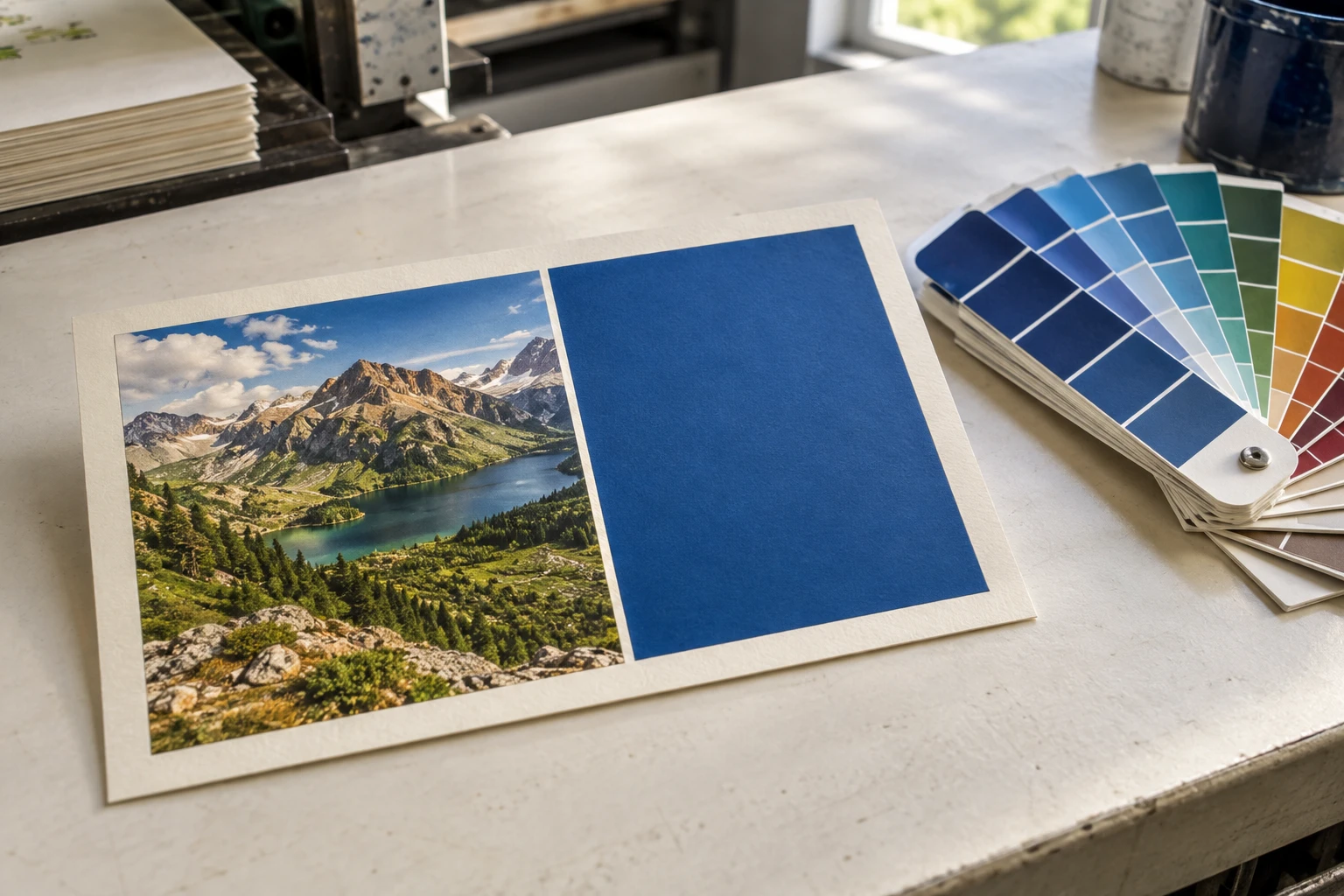
Photography-style illustration: a printed card with a photograph, blue panel and colour swatches
CMYK / Photos & multicolour artworkSPOT / Specified brand-colour area

The areas illustrate possible ink roles. This photo does not verify the inks used and is not a colour proof.

01 / CMYK

Four-colour process

Cyan, magenta, yellow and black combine through halftones to reproduce photos, gradients and multicolour artwork.

Artwork
Prepare CMYK artwork to the agreed requirements; check conversions.
Keep in mind
Some vivid screen colours lie outside the process-colour gamut.
02 / SPOT

Spot-colour printing

A premixed ink prints a specified area, often a logo or brand panel. Spot inks can be combined with process inks.

Artwork
Define and name spot colours separately; supply a complete PANTONE reference or an agreed physical sample.
Keep in mind
Spot ink does not guarantee a perfect match; stock and finishing still affect it.

Process and spot inks may be combined. A six-colour press does not require six inks for every job; the configuration is confirmed for the production plan.

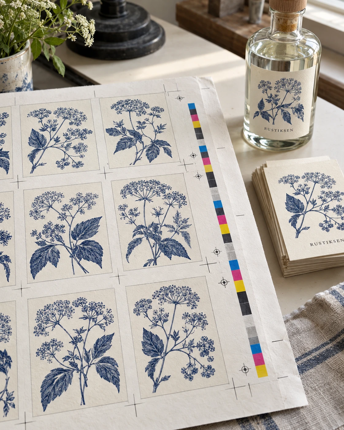
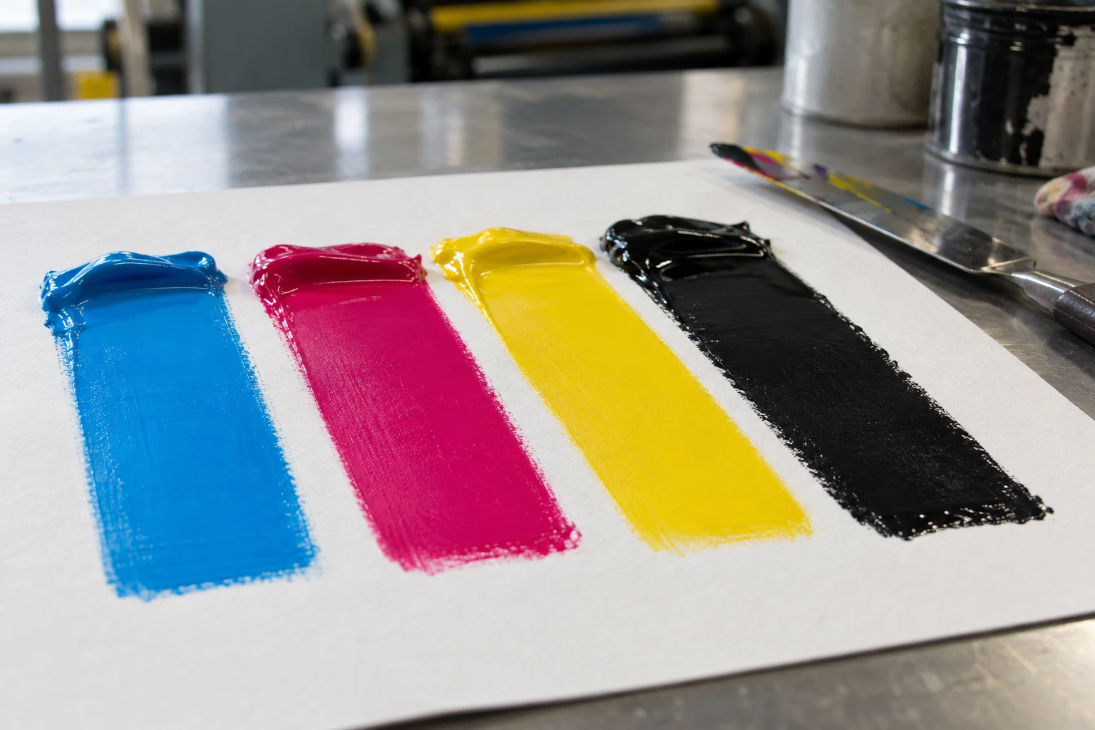
Photography-style illustration of cyan, magenta, yellow and black ink drawdowns on paper
CCyanMMagentaYYellowKBlack

From ink to halftones.

Process images combine halftone dots in different inks. This enlarged schematic explains overprinting, not the dot size or screen arrangement used in production.

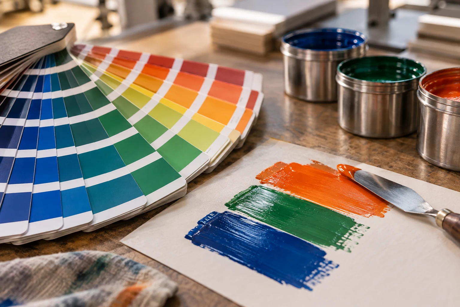
Photography-style illustration of physical printing colour swatches and an ink drawdown
Illustrative swatches and ink, not official Pantone colour standards or a colour proof.
PANTONE / SPOT-COLOUR REFERENCES

A colour reference.
A clearer brand brief.

Spot colours are commonly specified with PANTONE references. Provide the complete reference and guide information, and identify the areas requiring spot ink.

C / Coated
Colour appearance on coated paper in the guide.
U / Uncoated
Colour appearance on uncoated paper in the guide.

The suffix is part of the reference; do not supply the number alone. The same ink can appear different on different papers. Agree the physical reference and proofing plan together.

Process colour & screens

Print can only aim to approximate the appearance of your file on screen; an identical match cannot be guaranteed. Display settings, stock colour, ink and finishing affect the result. A computer or phone screen cannot be the sole colour reference.

Specify spot colours

Provide colour references or a physical sample and identify spot-colour areas. Spot inks cannot guarantee an exact screen match either. For critical colours, agree on proofing and a colour approval reference before production.

Clear stock & white ink

Clear and metallic stocks affect appearance. Where white ink is required, specify its area and layering separately and confirm equipment compatibility.

05 / CUT & FINISH

One layer for artwork.
Another for finishing.

Separate and name cut contours, fold lines and hole positions from printable artwork. Production guides are not decorative lines to print on the product.

Provide closed contours for shaped labels. Confirm fold style and reading order for folded pieces, and hole size and placement for punched items. Mark any local finishing areas separately.

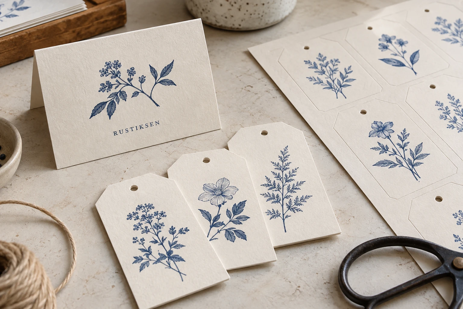
Photography-style illustration of printed proofs and surface finishes
Review artwork and finishing requirements together.Blue guides are schematic, not dimensions of the photographed items.
06 / READY TO SEND

Before you send,
take one last look.

Review each item and send a complete brief.

YOUR NEXT CHAPTER

Get your design ready for print.

Feasibility depends on stock, specifications and artwork, and is subject to our review.
Colour reference: Adobe — spot and process colours ↗Pantone: coated and uncoated references ↗